Line Graph Synonyms: Better Alternatives, Related Terms & Examples
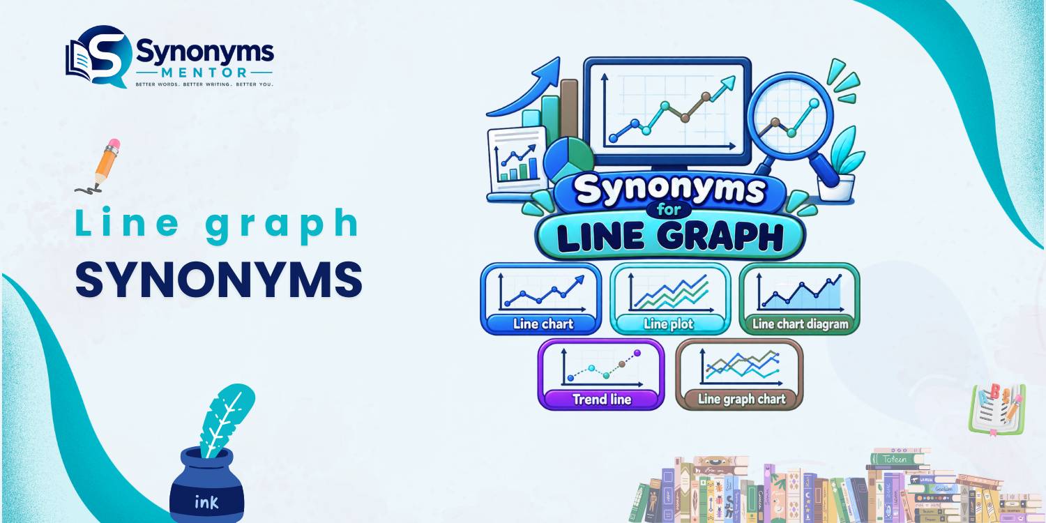
Looking for a different way to say line graph? The best alternative is usually line chart, which is widely used to describe the same type of visual representation. Cambridge lists line chart as another term for line graph, while other reputable sources use the two expressions interchangeably.
However, not every expression associated with line graphs is a true synonym. Terms such as line plot, time-series chart, and trend graph can overlap with line graph in particular contexts, but each can carry a slightly different emphasis. Choosing the right term therefore depends on what the graph shows and the context in which you are writing.
This guide separates genuine synonyms from related and context-specific alternatives so you can choose the most natural wording for academic writing, business reports, data analysis, and everyday communication.
Quick Answer
The closest and most reliable synonym for line graph is line chart. Other related alternatives include line plot, time-series chart, trend graph, and trend chart, but these are not interchangeable in every context. A time-series chart, for example, specifically emphasizes data ordered over time, while trend graph emphasizes the pattern or direction shown by the data.
Core Line Graph Synonyms and Alternatives
| Word or phrase | Relationship | Meaning | Best context |
|---|---|---|---|
| Line chart | Direct synonym | A chart using connected lines to display data | General, academic, business |
| Line plot | Near synonym | A plotted sequence of values connected or represented along an ordered scale | Data visualization, technical contexts |
| Time-series chart | Contextual alternative | A chart showing values arranged across time | Finance, science, statistics |
| Time-series graph | Contextual alternative | A graph representing measurements over time | Statistics, research |
| Trend graph | Contextual alternative | A graph emphasizing a trend or direction in data | Reports, analysis |
| Trend chart | Contextual alternative | A chart used to display a pattern of change | Business, reporting |
| Data trend chart | Descriptive alternative | A chart highlighting patterns or changes in data | General/business writing |
| Growth chart | Contextual alternative | A chart showing development or increase | Growth, performance, population |
| Progress graph | Contextual alternative | A graph showing development or progress | Education, projects, performance |
| Statistical line chart | Descriptive term | A line chart used to present statistical information | Statistics, research |
Important: These terms should not all be treated as exact synonyms. Line chart is the strongest direct replacement for line graph. The others become appropriate only when their additional meaning fits the context.
What Does “Line Graph” Mean?
A line graph is a visual representation in which data points are connected by lines to show the relationship between values. It is commonly used to make changes, patterns, and trends easier to see.
Merriam-Webster defines a line graph as a graph in which points representing values are connected by a broken line. Oxford similarly describes it as a diagram showing the relationship between measurements through points joined by lines.
For example:
The line graph shows changes in monthly sales.
You could naturally rewrite this as:
The line chart shows changes in monthly sales.
Here, line chart is a direct and natural substitute.
The Best Synonym: “Line Chart”
Line Chart
Meaning: A chart that uses lines to connect data points and display relationships or changes.
Relationship to “line graph”: Direct synonym.
Best contexts: Almost all contexts in which line graph is used.
Register: Neutral and professional.
Example
The report includes a line chart showing monthly website traffic.
This is essentially equivalent to:
The report includes a line graph showing monthly website traffic.
Cambridge gives line chart as another term for line graph, and major data-visualization resources also use the expressions interchangeably.
Choose “line chart” when:
- You want a natural alternative to line graph.
- You are writing a business report.
- You are describing a presentation.
- You want to avoid repeating line graph.
- You are writing about data visualization generally.
Bottom line: If you need one replacement, use line chart.
Near Synonyms and Contextual Alternatives
1. Line Plot
Line plot can overlap with line graph, particularly in data visualization contexts, but it should not automatically be treated as an exact synonym.
Some visualization resources use line plot as another name for a line chart. However, terminology can vary by field, so line chart remains the safer general-purpose replacement.
Example
The researcher created a line plot to examine the measurements.
Best for:
- Technical writing
- Data analysis
- Statistical contexts
Use with caution:
If your audience expects standard business or educational terminology, line chart is usually clearer.
2. Time-Series Chart
A time-series chart is more specific than a general line graph.
It emphasizes that the data is arranged according to time—for example, days, months, quarters, or years.
Example
The time-series chart shows the company’s revenue from 2018 to 2025.
A line graph can display relationships that are not necessarily time-based, so time-series chart should not replace line graph in every sentence. Data-visualization guidance commonly describes line charts as especially useful for showing changes over time.
Choose “time-series chart” when:
The horizontal axis represents time and that fact is important to your explanation.
3. Time-Series Graph
Time-series graph has essentially the same contextual limitation as time-series chart.
It is useful when the graph represents observations collected sequentially over time.
Example
The time-series graph reveals a steady increase in average temperatures.
Best for:
- Statistics
- Scientific research
- Economics
- Financial analysis
It is more precise than simply saying line graph when the temporal nature of the data matters.
4. Trend Graph
A trend graph emphasizes the direction or pattern of change rather than simply the visual format.
Example
The trend graph shows a gradual decline in unemployment.
The phrase can be useful in explanatory writing, but it is better regarded as a contextual alternative, not a strict synonym.
A line graph can show trends, but a graph emphasizing a trend is not necessarily defined by the fact that it is a line graph.
Choose “trend graph” when:
Your main point is the trend, such as:
- rising
- falling
- stable
- fluctuating
- accelerating
5. Trend Chart
Trend chart works similarly to trend graph.
Example
The trend chart highlights the increase in customer demand.
It is particularly natural in business and reporting contexts.
However, it describes the purpose or emphasis of the visualization rather than necessarily identifying its exact chart type.
6. Growth Chart
A growth chart is appropriate when the visualization specifically tracks growth or development.
Example
The growth chart shows the company’s expansion over five years.
It can be represented as a line chart, but not every line graph is a growth chart.
For example, a line graph showing falling temperatures would not naturally be called a growth chart.
7. Progress Graph
A progress graph focuses on improvement or development.
Example
The teacher used a progress graph to monitor students’ performance.
This term works well when the purpose is tracking progress, but it is not a general synonym for every line graph.
Which Word Should I Use?
The easiest way to choose is to ask what you want to emphasize.
Choose line chart when:
You simply need another name for a line graph.
The presentation contains a line chart of annual sales.
Choose line plot when:
You are writing in a technical or data-analysis context where the term is appropriate.
The researchers produced a line plot of the measurements.
Choose time-series chart when:
The data is explicitly organized over time.
The time-series chart tracks daily stock prices.
Choose trend graph when:
The important feature is the direction or pattern of change.
The trend graph reveals a steady decline.
Choose growth chart when:
The graph specifically tracks growth or development.
The growth chart illustrates the company’s expansion.
Choose progress graph when:
You are tracking improvement or advancement.
The progress graph shows how students’ scores changed throughout the semester.
Line Graph vs. Line Chart
There is usually no meaningful difference between line graph and line chart in ordinary data-visualization language.
Both can describe a visualization that connects data points with lines. Cambridge explicitly cross-references the two terms, and major visualization resources use them interchangeably.
| Term | Meaning | Can replace “line graph”? |
|---|---|---|
| Line chart | Same basic visualization | Yes |
| Line plot | Similar visualization terminology | Sometimes |
| Time-series chart | Line-based or other chart for time-ordered data | Only in time-based contexts |
| Trend graph | Graph emphasizing a trend | Context-dependent |
| Growth chart | Chart showing growth | Only for growth |
| Progress graph | Graph showing progress | Only for progress |
Example
Original:
The line graph shows annual revenue.
Natural replacement:
The line chart shows annual revenue.
More specific alternative:
The time-series chart shows annual revenue.
The last version works because annual revenue is organized chronologically.
Line Graph vs. Line Plot
These terms can overlap, but they are not always equally appropriate.
A line graph generally refers to a graph in which data points are connected by lines to communicate relationships or changes.
A line plot, depending on the field, may be used for a similar visualization. Data-visualization sources sometimes list line plot alongside line chart and line graph.
For general readers, line graph or line chart is usually the clearest wording.
Line Graph vs. Time-Series Graph
The distinction is mainly about specificity.
A line graph describes the visual form.
A time-series graph describes data arranged over time.
For example:
The line graph compares the temperatures of three cities.
This is a line graph, but if the data is organized by date, it can also be described as a time-series graph.
However:
The line graph compares performance across three ordered categories.
Calling this a time-series graph would be inappropriate if those categories are not time-based.
Natural Collocations With “Line Graph”
If you are trying to vary your wording in an article, report, or essay, these common phrases are useful:
- line graph shows
- line graph illustrates
- line graph represents
- line graph displays
- line graph compares
- line graph indicates
- line graph demonstrates
- line graph depicts
- line graph presents
- line graph reveals a trend
Examples
The line graph illustrates changes in population.
The line graph compares monthly sales.
The line chart displays the company’s revenue over five years.
The time-series chart shows how prices changed during the period.
Notice that changing the verb can sometimes improve writing more naturally than replacing line graph with an unusual synonym.
Common Mistakes When Using Line Graph Synonyms
Mistake 1: Treating every related term as an exact synonym
Words such as growth chart and progress graph describe specific purposes. They should not automatically replace line graph.
Mistake 2: Using “time-series chart” for non-time data
A time-series visualization specifically involves observations ordered in time. If the horizontal variable is not time, another term may be more accurate.
Mistake 3: Replacing “line graph” with an unnatural phrase
Expressions such as data trend chart may be understandable, but they are not always the most natural choice for ordinary English.
When you simply need a synonym, line chart is safer.
Mistake 4: Confusing a line graph with every type of graph
A bar chart, pie chart, histogram, and scatter plot are related forms of data visualization, but they are not synonyms for line graph.
Merriam-Webster’s related-word results, for example, include terms such as pie chart and histogram because they belong to the broader graph/data-visualization vocabulary, not because they mean line graph.
Related Words for “Line Graph”
These words are associated with line graphs but should not normally be presented as synonyms:
- graph
- chart
- data visualization
- trend
- data point
- axis
- x-axis
- y-axis
- curve
- slope
- time series
- dataset
- coordinate
- variable
- statistic
- histogram
- bar chart
- scatter plot
- pie chart
These terms describe components, concepts, neighboring chart types, or broader categories.
For example, a scatter plot can display data points without connecting them in the same way as a line chart, so it should not be used as a synonym for line graph.
Formal Alternatives for “Line Graph”
If you are writing academically or professionally, these options are generally useful:
- Line chart — the safest direct alternative
- Line plot — appropriate in some technical contexts
- Time-series chart — when the data is time-based
- Time-series graph — when the data is time-based
- Trend chart — when emphasizing a trend
Best academic choice
Line chart
Example:
The line chart illustrates changes in average household income between 2015 and 2025.
Best time-based choice
Time-series chart
Example:
The time-series chart illustrates monthly fluctuations in demand.
Antonyms of “Line Graph”
Line graph is a technical noun describing a type of visualization, so it does not have a true antonym.
However, contrasting chart types can include:
- bar chart
- pie chart
- histogram
- scatter plot
- area chart
These are alternative visualization types, not antonyms.
For example, you might say:
A bar chart was used instead of a line graph.
You would not normally say:
A bar chart is the antonym of a line graph.
FAQ
What is another word for line graph?
The most direct alternative is line chart. The two terms are commonly used interchangeably. Depending on the context, you may also encounter line plot, time-series chart, or trend graph, but these can have more specific meanings.
Is “line chart” the same as “line graph”?
Yes, in ordinary data-visualization usage, line chart and line graph generally refer to the same type of visualization: data points connected by lines to show relationships or changes.
Is “line plot” a synonym for “line graph”?
It can be used as a near-synonym in some data-visualization contexts, but terminology varies by field. If you need an unambiguous general replacement, line chart is the better choice.
What is another word for a graph showing trends?
Depending on the visualization, you could use trend graph, trend chart, or line chart. Trend graph emphasizes the pattern being shown, while line chart identifies the chart format.
What is a time-series graph?
A time-series graph displays observations arranged according to time, such as daily temperatures, monthly revenue, or annual population figures. A line graph can be a time-series graph when its data is organized chronologically.
What is the best synonym for line graph in academic writing?
Line chart is usually the safest choice. If the graph specifically represents measurements over time, time-series graph or time-series chart may be more precise.
Can I use “trend chart” instead of “line graph”?
Only when the chart’s purpose is to emphasize a trend. Trend chart is a contextual alternative rather than a universal synonym for line graph.
Are bar chart and line graph synonyms?
No. Both are types of data visualization, but they use different visual forms and are commonly selected for different analytical purposes. A bar chart should therefore be described as a related chart type, not a synonym.
Conclusion
The strongest synonym for line graph is line chart. The two terms are widely interchangeable, making line chart the best choice when you simply want to vary your wording.
Other expressions require more care. Line plot can work in some technical contexts, while time-series chart is appropriate when the data is organized over time. Trend graph, trend chart, growth chart, and progress graph describe particular purposes or emphases rather than functioning as universal synonyms.

Our editorial team is dedicated to making English vocabulary easier to understand and use correctly. We research and review synonyms, antonyms, definitions, word usage, and example sentences to ensure our content is clear, accurate, practical, and useful for students, writers, professionals, and English learners.